
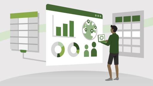
In this course, students will gain foundational knowledge of core data concepts and related Microsoft Azure data services. Students will learn about core data concepts such as relational, non-relational, big data, and analytics, and build their foundational knowledge of cloud data services within Microsoft Azure. Students will explore fundamental relational data concepts and relational database services in Azure. They will explore Azure storage for non-relational data and the fundamentals of Azure Cosmos DB. Students will learn about large-scale data warehousing, real-time analytics, and data visualization.
The audience for this course is individuals who want to learn the fundamentals of database concepts in a cloud environment, get basic skilling in cloud data services, and build their foundational knowledge of cloud data services within Microsoft Azure.

Course duration: 2,21h
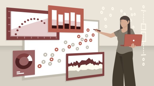
Visualizing data sets as charts and graphs can do wonders to communicate complex business needs, depict underlying patterns, and make data trends crystal clear. But you need to develop your understanding of the many types of visualization elements that exist—and when and how to use which to be most effective. In this course, join designer and infographics expert Amy Balliett as she takes a deep dive into next-level data visualization strategies with advanced charts and graphs. Learn how our brains respond to data visualization to inform your selection strategy. Amy covers various types of charts and graphs, offering advice and tips for how to render them effectively to represent distribution, comparison, relationships, and composition. Discover how to use visualizations such as plots, Sankey diagrams, alluvial charts, parallel sets, bullet graphs, radial charts, Coxcomb charts, coordinate plots, chord diagrams, maps, Marimekko charts, streamgraphs, and more.
Topics include:
This course is in French only. If this is not a problem for you, by all means go ahead and apply.

Course duration: 0,79h
Suggested Prerequisites Have a basic understanding of how data visualization works. Be familiar with why different kinds of plot types are used. Have some knowledge of univariate, bivariate, and multivariate statistics. Know this is not a coding course and will not teach how each graph is recreated. Data visualization is a critical component of data analysis and data science. In this course, economics professor Franz Buscha introduces you to 10 types of graphs that you would not commonly encounter in regular practice. For each type of graph, Franz presents a data visualization problem and an advanced graph type that solves the problem. He explains each graph and its variations, then highlights some useful tips of what to do and what not to do. Data visualizations include ridgeline plots, violin plots, heat plots, sparkline plots, rainbow plots, table plots, mosaic plots, matrix plots, ternary plots, and Chernoff faces.
Topics include:
- Learn how to visualize multiple complex data distributions on a single plot for easy comparison.
- Discover how kernel density plots and box plots can be combined into a single powerful visualization that provides aggregate summary information and local distributional information.
- Review how color and binning choices can be used to identify bivariate densities in overplotted scatterplots.
- Learn how line plots can be reduced to their essentials and incorporated into other tables and graphs while continuing to emphasize patterns in a change of value.
- Learn how careful color gradation can be used to make sense of overplotted line plots.
- Learn how you can modify cell appearance to include bar charts to quickly give a visual overview of how the data is distributed between two categorical variables.
- Learn how a stacked bar graph can be adjusted to provide an additional dimension of data that reveals relative frequency in each bar.
- Learn how multiple scatterplots can be combined to quickly provide a visual overview of many different correlations in a dataset..
- Learn how to scatterplot three different variables that add up to a constant value on three different axes.
- Learn how representations of data as human faces can allow users to quickly compare multivariate data and identify similar and dissimilar observations.
This course is in French only. If this is not a problem for you, by all means go ahead and apply.

Media and marketing efforts often rely on data visualizations to prove a point quickly. But poorly designed visualizations can be misleading and can even become a source of global scrutiny. To succeed in design and marketing today, you need to know how to interpret and properly visualize data. This course, developed and led by Killer Infographics CEO, Amy Balliett, walks you through the ins and outs of creating accurate and compelling data visualizations. She shows you how to identify and shape your data with key questions, as well as how to avoid common data visualization mistakes. Amy covers creating bar graphs, pie charts, line graphs, and area graphs in Adobe Illustrator and goes over how to better contextualize your data visualizations with labels and color. Using these tips, you'll learn how to stand out from the crowd and create charts and graphs that combine precision with visual appeal.
Topics include:
Deze cursus is enkel beschikbaar in het Engels. Als dit voor u geen probleem vormt, dien dan gerust uw aanvraag in.
This course is in French only. If this is not a problem for you, by all means go ahead and apply.

Course duration: 13,48h
Data visualization continues be one of the most in-demand skills as business and enterprises of all types pivot to being data-driven. This learning path is designed for data- and analytics workers and professionals of all levels who want to build superior interpretive and communications skills in the art of data visualization and storytelling.
-
Explore the world of concepts that, when mastered, enable you to tailor any data message to any audience for maximum effectiveness.
-
Compare the different storytelling approaches for widely varied situations, and learn to pick the right one every time.
-
Create data visualizations that don't just show findings, but help teams discover high-value insights that push businesses forward.
Deze cursus is enkel beschikbaar in het Engels. Als dit voor u geen probleem vormt, dien dan gerust uw aanvraag in.
This course is in French only. If this is not a problem for you, by all means go ahead and apply.

When selecting charts to showcase data, many people simply pick from the few choices available in Excel or other such software. This can be highly limiting, and can result in the selection of charts that fail to effectively convey whatever you're trying to communicate. This course can help you think more strategically about your data, and provide you with the tools you need to pick the best visual display for the type of data you're working with—and your ultimate communication goals. Main topics include getting to the key idea you're trying to communicate; finding the right standard chart for your data type; and brainstorming and experimenting to come up with alternatives to the standards.
Topics include:
Deze cursus is enkel beschikbaar in het Engels. Als dit voor u geen probleem vormt, dien dan gerust uw aanvraag in.
This course is in French only. If this is not a problem for you, by all means go ahead and apply.

Course duration: 1,54h
We are wired for story. We crave it. Storytelling has played an integral role in our ability to make progress as a species. It should come as no surprise, then, that presenting data and information in story form maximizes the effectiveness of our communication. We can create deeper emotional responses in our audience when we present data in story form. Join data visualization expert Bill Shander as he guides you through the process of turning "facts and figures" into "story" to engage and fulfill our human expectation for information. This course is intended for anyone who works with data and has to communicate it to others, whether a researcher, a data analyst, a consultant, a marketer, or a journalist. Bill shows you how to think about, and craft, stories from data by examining many compelling stories in detail.
Topics include:
- Describe the historic progress of storytelling as a means of communication.
- Define acronyms relating to storytelling.
- Identify the components of a flow diagram.
- Determine the appropriate times to use labels.
- Describe the process by which people read visualizations.
- Review the concepts of complexity and simplicity in using visualizations.
This course is in French only. If this is not a problem for you, by all means go ahead and apply.

Many anthropologists believe our early ancestors built societies around campfire stories about justice, leadership, and government. Your data science teams will also have complex ideas about their data and results. That's why it takes a well-structured story to communicate these insights to the rest of your organization. It's not simply a matter of creating the perfect Excel sheet or a beautiful graph. You need to tell a story that captures your audience's imagination and encourages them to take some action. In this course, instructor Doug Rose explains how to weave together a great data science story and draw your audience into the story to communicate complex ideas and motivate everyone to make real changes.
Topics include:
- List the five threads your team should focus on when spinning a yarn.
- Explain the benefits of using scenarios as story helpers.
- Explore how using conflict in a story can captivate your audience.
- Determine how details will enhance a story and make it memorable.
- Recall the downfalls of using too many visualizations.
- Define vision in the context of data-science storytelling.
- Recognize the features of good storytelling.
Deze cursus is enkel beschikbaar in het Engels. Als dit voor u geen probleem vormt, dien dan gerust uw aanvraag in.
This course is in French only. If this is not a problem for you, by all means go ahead and apply.

Got a big idea? You need to get it across quickly and efficiently, or modern audiences will move on to the next story clamoring for their attention. Data visualization allows you to make the complex simple, the abstract tangible, and the invisible visible. In this course, Bill Shander shows how to think about your data, your audience, and your goals to create visuals that maximize impact. Plus, learn about human visual perception and chart selection strategies, which make all the difference when visualizing data.
Topics include:
Deze cursus is enkel beschikbaar in het Engels. Als dit voor u geen probleem vormt, dien dan gerust uw aanvraag in.
This course is in French only. If this is not a problem for you, by all means go ahead and apply.
Data Visualization Tips and Tricks is a series of standalone lessons on how to do data viz the right way, every time. Presented by award-winning data visualization expert (and Tableau-designated "Zen Master") Matt Francis, this software-agnostic course is designed for experienced data scientists and analytics specialists and serves as a must-have bank of knowledge and best practices. Learn how to choose the right visualization for your data, and answer the 5 key questions you should ask yourself at the beginning of every project. Topics include understanding the relationships between data sets, making comparisons, charting relationships, visualizing data distributions, creating maps, and—most valuably—knowing when to use which types of graphs and charts. Matt also teaches you how to understand what others are doing with their own visualizations, ask informed questions, and look with a critical eye at the work of others.
Topics include:
- Explain the importance of data visualization.
- Determine when an infographic or an exploratory dashboard would be most appropriate.
- Identify the elements of a Gantt chart.
- Recall the characteristics of four kinds of distribution.
- Recognize the drawbacks of using a pie chart.
- Explain when to use a symbol map.
Deze cursus is enkel beschikbaar in het Engels. Als dit voor u geen probleem vormt, dien dan gerust uw aanvraag in.
This course is in French only. If this is not a problem for you, by all means go ahead and apply.
Course duration: 1,74h
As a data analyst, you probably already know how to build visualizations and use tools like Excel and Tableau. This course challenges you to go beyond the data, beyond the software, and start thinking more clearly and strategically about the foundations of great communication design. Bill Shander, founder of Beehive Media, focuses on the key challenges that analysts face trying to communicate complex information, and how visual communication can help. Bill takes a deep dive into important strategies for visual analysis. He then breaks down ten key components of great data visualizations—built in any program—and shows innovative ways of rethinking the slides, charts, diagrams, and dashboards you work with every day.
Topics include:
- Describe the importance of audience and story in designing visual presentations.
- Identify Gestalt principles for visual processing.
- Compare and contrast headline styles.
- List general rules for the use of different chart types, colors, axes, and other formatting details.
- Understand the importance of and scientific basis for guiding principles in presentation design.
This course is in French only. If this is not a problem for you, by all means go ahead and apply.